
I'm not a fan.
The squished into the middle of the page thing is irritating.
The color scheme is irritating.
That awful underdark picture background needs to go. Luckily I can just adblock it.
The inability to hide certain elements in my "settings" page (wish we still had a userCP button) i.e. I cannot collapse the list of my infractions. Previously there was a little arrow that would allow me to collapse them down so I didn't have to scroll past them every time. I don't mind seeing them, but I don't want to wear out my scroll wheel.
The broken bookmarks suck. I'm shocked there isn't some sort of redirect that would let people find the threads they lovingly bookmarked at least the first time so they could update.
I think that having to log in with my in-game user account is asinine, but we've been over that to infinity and Turbine has shown how many figs they give about that feedback (the answer is zero. Zero figs given.)
I don't like the lack of the old dev tracker/service tracker
I don't like that the lamannia dev tracker crashes my browser.
I don't like that there are so many people that had to choose a different name from their old forum name because the migration and "upgrade" was poorly thought out and poorly executed.I was one of the "lucky" ones who simply had to re-enter my country in the myaccount page. Which is another thing entirely. It shouldn't have to be that complicated, but it is.
I don't like getting logged out after navigating a few pages around.
I don't like that I can't use a Dispel arrow for my Post Icon anymore
I DO like that I can see who has given me rep. Just sad I haven't received any neg rep lately
I DO like that apparently my posts are auto-saved as I type (I've seen a little flash in the bottom right corner every 20ish seconds). I'm not sure where they are saved, but apparently they are saved somewhere.
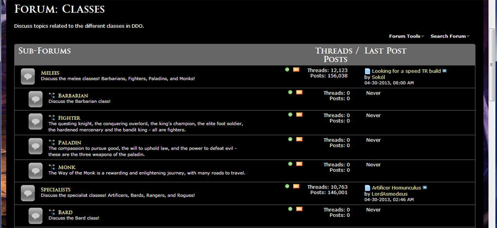
I DO like that the class sub forums have been seperated out again. If only you had listened to the enormous amount of feedback when you first (foolishly) combined them. It's only what 2 years too late? I guess hopefully that means in 2 years you'll go back to the old much much much much much better old forums. Assuming that DDO lasts 2 more months, let alone 2 more years. Doesn't look good at this point (I'm looking at YOU enhancement pass)
I really wish this hadn't come to pass, but it's pretty obvious that Turbine really couldn't care any less about their customers' concerns and feedback. I feel like this is me just screaming into the abyss, but at least I got it off my chest.
Results 1 to 15 of 15
Thread: New Forum Changes Feedback.
-
04-29-2013, 09:12 PM #1Community Member


- Join Date
- May 2006
- Posts
- 756
 New Forum Changes Feedback.
-
04-29-2013, 09:14 PM #2Bwest Fwiends

- Join Date
- Jul 2006
- Posts
- 0

Agreed on pretty much all points.
Exit, pursued by a bear. ~ William Shakespeare (stage direction from The Winter's Tale)
 .60284.
-
04-29-2013, 09:18 PM #3Community Member
- Join Date
- May 2006
- Posts
- 756
Oh and the default font is god-awful.
-
04-29-2013, 09:54 PM #4Hatchery Hero

- Join Date
- Jan 2011
- Posts
- 807
My biggest beef so far is just plain bad use of screen real-estate. A frame that doesn't read my screen res and adjust it's size automatically? What is this? 1989? Look at any subforum. 7 threads from top to bottom, instead of the old 24. You may as well have drawn them in with crayon. Same goes for posts within a thread. Soooo spaced out it's a chore to read.
My only hope right now is that I'll be able to figure out how to CSS this down to my own liking. So far, it's just another half-done make-work project that didn't need to be done in the first place.
Oh, wow. Just went hunting for the 'Submit reply' button. Of course it's spaced down way below the text entry box, and over to the side. Why? What was wrong with having it tucked neatly right below the box, in the center where it's obvious?
Just waay too much padding going on. Let's make it look professional and have it lose some of this padding weight. Originally Posted by Towrn
-
04-29-2013, 10:03 PM #5Community Member

- Join Date
- Apr 2013
- Posts
- 28
Don't like:
Default font. It's stupidly difficult to read.
"Squished" forum column. I have so much wasted screen space.
Had to choose a new forum name. I want my old name back.
Background picture that serves no purpose other than to let me know how much of my screen space isn't being taken up by the actual forum.
Do like:
That most, if not all of these issues have player-found workarounds. Turbine, this is something you should have worked into the "upgrade". Not something that we have to search threads for in order to "fix" things that weren't broken before.
I do like that the community is coming together to help each other fix the upgrade so it actually feels usable again.
-
04-29-2013, 10:04 PM #6Hatchery Hero
- Join Date
- Jan 2011
- Posts
- 807
Going to my Settings page (what used to be called UserCP) and mousing over the left hand side options, each item shows an unreadable white on white when the mouse is over.
Also in the Settings page, my recent active topics don't seem to have a 'go to first unread' button. I can to last post or first post only.
And I just HAVE to repeat: not using my full screen width is pure amateur. I can't tell you how much this is annoying me.Last edited by BOgre; 04-29-2013 at 10:06 PM.
Originally Posted by Towrn
-
04-29-2013, 11:07 PM #7Community Member
- Join Date
- May 2006
- Posts
- 756
I also dislike the blinding white box that quotes appear in.
I also dislike the fact that my PMs look like this:

I didn't bother to blur out the titles of my PMs, because they're so **** hard to read! Even if you can read the titles (they're a bit easier to read when it's a screenshot, for some reason) the names of the senders is completely obscured.
I also hate that all pictures are auto-scaled, and you can't click on them to view them full size. I have a 24" monitor, I don't need you to shrink the pictures down for me.
-
04-29-2013, 11:18 PM #8Community Member
- Join Date
- Apr 2013
- Posts
- 14
This forum does make my 24" monitor feel small......
-
04-30-2013, 03:14 AM #9Hatchery Hero
- Join Date
- Jan 2011
- Posts
- 807
It's interesting to note that 15 minutes with Stylebot (.css editor) got me the forums looking correct.
Here's what I used, and there's the edited css. Use at your own risk.
Stylebot for Chrome
edited .cssLast edited by BOgre; 04-30-2013 at 03:32 AM.
Originally Posted by Towrn
-
04-30-2013, 10:00 AM #10Founder & Hero

- Join Date
- Feb 2006
- Posts
- 2,854
I created a stylebot CSS edit as well

http://stylebot.me/styles/2384
Included changes for the class (and other subforums), quoted replies and forum with basic styling - not perfect, by any means, but it made it more bearable for me

Last edited by jjflanigan; 04-30-2013 at 10:05 AM.
-
04-30-2013, 10:49 AM #11Community Member
- Join Date
- Apr 2013
- Posts
- 12
Lack of search/todays posts controls on the main forum page.
Can't store login info? Rly?
-
04-30-2013, 10:56 AM #12Community Member

- Join Date
- Apr 2013
- Posts
- 222
How does one leverage this, please? Originally Posted by jjflanigan


-
04-30-2013, 10:58 AM #13Community Member
- Join Date
- Apr 2013
- Posts
- 2
I absolutely hate it with a burning passion.
-
04-30-2013, 11:43 AM #14Community Member

- Join Date
- Aug 2010
- Posts
- 0
As I haven't mentioned I was hating the changes... I hate it, bring back the old forum. This one looks like SWTOR, and is a PITA to navigate when it's not FUBARed by the logout or any other problem.
On G-Land : Flavilandile, Blacklock, Yaelle, Millishande, Larilandile, Gildalinde, Tenalafel, and many other...
-
05-11-2013, 08:55 PM #15Community Member
- Join Date
- May 2013
- Posts
- 2
Its a bit like the game.
These fools make 2 lists
List 1 -
Easy to use, proven, consumer driven / welcomed, appealing, focused on playability and enjoyment, fun, customizable etc
List 2 -
Difficult, annoying, ********, ugly, frustrating, pointless, linear, fixed, random, contradictory, etc
Some ****** keeps grabbing the second list.


 Reply With Quote