Results 1 to 19 of 19
  1. #1
    Community Member ~Holamdar's Avatar
    Join Date
    Apr 2013
    Posts
    5

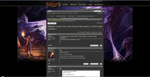
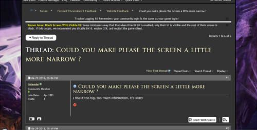
    Question Could you make please the screen a little more narrow ?

    I find it too big, too much information, it's scary


  2. #2
    Community Member ~Dyna-The-Cat's Avatar
    Join Date
    Apr 2013
    Posts
    45

    Default

    What do you mean....?

    Like... the words are too big?

    Hold ctrl and scroll your mouse wheel up to make bigger?

    Hold ctrl and scroll your mouse wheel down to make smaller?

  3. #3
    Community Member ~Holamdar's Avatar
    Join Date
    Apr 2013
    Posts
    5

    Default

    Quote Originally Posted by Dyna-The-Cat View Post
    What do you mean....?

    Like... the words are too big?

    Hold ctrl and scroll your mouse wheel up to make bigger?

    Hold ctrl and scroll your mouse wheel down to make smaller?
    Fail to understand how zoom can help here, see it bigger?, even smaller?, simply the forum area is too narrow ... like we were still using on 800x600 screens, or too much willing to show the "fancy" art


    Someone already found some "solution" going to some basic skin that in exchange burns your eyes with wite

  4. #4
    Producer Tolero's Avatar
    Join Date
    Sep 2007
    Posts
    0

    Default

    Quote Originally Posted by Holamdar View Post
    Fail to understand how zoom can help here, see it bigger?, even smaller?, simply the forum area is too narrow ... like we were still using on 800x600 screens, or too much willing to show the "fancy" art


    Someone already found some "solution" going to some basic skin that in exchange burns your eyes with wite
    Will check with the web devs to see if they can make it a little more stretchy.

  5. #5
    Community Member ~Holamdar's Avatar
    Join Date
    Apr 2013
    Posts
    5

    Default

    Quote Originally Posted by Tolero View Post
    Will check with the web devs to see if they can make it a little more stretchy.
    Thanks :-)

  6. #6
    Bwest Fwiends Memnir's Avatar
    Join Date
    Jul 2006
    Posts
    0

    Default

    Only some stuffed shirt with a fatal case of hubris would have thought that the side-frames on the page would in any way be a good thing. I don't want to see lousy MotU concept art every goddamned time I browse the forums... and I certainly don't need the 2001 look of the Mobil version of the new forums scorching my retinas. There is no good option in looking at the DDO forums as of today.


    Way to prove that yet again that there isn't a good thing that Turbine can't find a way to screw up.
    Exit, pursued by a bear. ~ William Shakespeare (stage direction from The Winter's Tale)

    .60284.

  7. #7
    Community Member Myrddinman's Avatar
    Join Date
    Mar 2006
    Posts
    701

    Default

    Quote Originally Posted by Tolero View Post
    Will check with the web devs to see if they can make it a little more stretchy.
    I would like more stretchy

    Since the graphic is only at the top, is it possible to pull the forum window underneath it and widen it? I assume it is narrow so that the graphic is visible?
    Quote Originally Posted by 404error View Post
    there will always be bugs in DDO it will never be bug free at any point in its lifetime.

  8. #8
    Community Member ~Dyna-The-Cat's Avatar
    Join Date
    Apr 2013
    Posts
    45

    Default

    Quote Originally Posted by Holamdar View Post
    Fail to understand how zoom can help here, see it bigger?, even smaller?, simply the forum area is too narrow ... like we were still using on 800x600 screens, or too much willing to show the "fancy" art


    Someone already found some "solution" going to some basic skin that in exchange burns your eyes with wite
    Please try what I suggested, because it's exactly what I meant.....

    And it works....

  9. #9
    Community Member ~Dyna-The-Cat's Avatar
    Join Date
    Apr 2013
    Posts
    45

    Default

    Me zoomed out


    Me zoomed in:


    Don't think there's a way they can adjust your screen / browser settings for you.....

    Edit: Same sized screen btw... and nothing is blurry.... text just gets bigger and forum area gets bigger.
    Last edited by Dyna-The-Cat; 04-29-2013 at 12:43 PM.

  10. #10
    Community Member ~Elaynne's Avatar
    Join Date
    Apr 2013
    Posts
    3

    Default

    Fixed width = modern! Seriosuly every forum I've seen that does one of these "upgrades" switches to a fixed width optimised for like a 800x600 screen...

  11. #11
    Community Member ~Holamdar's Avatar
    Join Date
    Apr 2013
    Posts
    5

    Default

    Quote Originally Posted by Dyna-The-Cat View Post
    Me zoomed out

    Me zoomed in:

    Don't think there's a way they can adjust your screen / browser settings for you.....

    Edit: Same sized screen btw... and nothing is blurry.... text just gets bigger and forum area gets bigger.
    I checked before and yes that's exactly what I saw, smaller is senseless is already small enough, and bigger, what's the use on watching it bigger?, feel like you were reading a book for a 3 years old child? I don't want to SEE it bigger I want it to BE wider

    They can as Tolero said make an upgrade and make the wide customizable, place a combo with sizes in a range from 800 to 1500 or higher, that would solve it, and can be done, after all that wide is defined somewhere in the CSS and can be customized.
    Last edited by Holamdar; 04-29-2013 at 01:05 PM.

  12. #12
    Community Member
    Join Date
    Apr 2013
    Posts
    3

    Default

    Quote Originally Posted by Memnir View Post
    Only some stuffed shirt with a fatal case of hubris would have thought that the side-frames on the page would in any way be a good thing. I don't want to see lousy MotU concept art every goddamned time I browse the forums... and I certainly don't need the 2001 look of the Mobil version of the new forums scorching my retinas. There is no good option in looking at the DDO forums as of today.


    Way to prove that yet again that there isn't a good thing that Turbine can't find a way to screw up.
    Mem, maybe you're being a little harsh.

    I'm sure Turbine has Top Men (and women, of course) testing and developing these changes.

    They are Experts, and Experts know best.

    Anyway, Tolero has already indicated that more changes are coming, so I'm sure that it'll all be fine even though it looks pretty rough right now.

    Remember "Nothing is set in stone"!

    Quote Originally Posted by Tarrant View Post
    May I suggest that before you hold people accountable and determine that things could have been done differently, you see what the finished product is and the reasoning behind what was done? You may feel the same as you do now, but at least you'll have a more complete picture.
    All the parts of the finished product may not please everyone, but maybe everyone will be able to find something about the new system that they love, and that should be good enough.

  13. #13
    Community Member
    Join Date
    Apr 2013
    Posts
    19

    Default

    If you're comfortable creating a user style sheet and custom CSS rules...

    For example, in Chrome go to:
    C:\Users\{ACCTNAME}\AppData\Local\Google\Chrome\Us er Data\Default\User StyleSheets\custom.css


    And put in:
    .vb .body_wrapper {
    width:100% !important;
    }

    And that will override the default 960px centered column actually allowing the main body to fill the browser frame.

  14. #14
    Community Member
    Join Date
    Apr 2013
    Posts
    12

    Default

    Quote Originally Posted by Dyna-The-Cat View Post
    Me zoomed out


    Me zoomed in:


    Don't think there's a way they can adjust your screen / browser settings for you.....

    Edit: Same sized screen btw... and nothing is blurry.... text just gets bigger and forum area gets bigger.
    OP is not talking about zooming (seeing same stuff bigger) but about a bigger content area (seeing more content).

    The layout of the new forums is aparently not liquid (pages you can rarely see on web, the kind that stretches your content area to fit your browser size. decent examples are google, gmail...). If you try resizing the browser window while using gmail you will see the page will readjust to the new visible dimensions.

    Now if you are not using a liquid layout you need to set a fixed page width as the page will not adjust to the users browser size. This size is usually set to match the lowest sufficiently used desktop resolution. Seems today in 2013, 1024x768 still is widely used so that's the width you get for these forums. This ensures that almost all of the people using these forums will never need to scroll horisontally when reading the posts.

    Liquid layouts exist since the begining of the web. I'm a big supporter of liquid layouts myself but seams nobody rly cares about it to make quality stuff like that these days.

  15. #15
    Community Member ~no_name_displayed's Avatar
    Join Date
    Apr 2013
    Posts
    15

    Default

    Quote Originally Posted by Memnir View Post
    Only some stuffed shirt with a fatal case of hubris would have thought that the side-frames on the page would in any way be a good thing.
    The only other site using such kind of skyscrapers on the left and the right of the forums is a fan-founded, ad-funded Diablo3-site.
    Quote Originally Posted by Memnir View Post
    I think it's time for a divorce. At the very least, I think I need to start seeing other, more attractive, forums.

  16. #16
    Community Member
    Join Date
    Apr 2013
    Posts
    8

    Default

    Quote Originally Posted by Ruda View Post
    Liquid layouts exist since the begining of the web. I'm a big supporter of liquid layouts myself but seams nobody rly cares about it to make quality stuff like that these days.
    Hahaha, I hope that's a joke right? Fluid and even more so responsive layouts (that change the way content is displayed based on window width, not just dimensions, but how things look and how they are placed in the page) are pretty much the trend right now.

  17. #17
    Community Member
    Join Date
    Apr 2013
    Posts
    12

    Default

    Quote Originally Posted by moriedheliwas View Post
    Hahaha, I hope that's a joke right? Fluid and even more so responsive layouts (that change the way content is displayed based on window width, not just dimensions, but how things look and how they are placed in the page) are pretty much the trend right now.
    A joke? These techniques have been considered a "trend" since i can remember in web designer circles. And we are talking over a decade here. What did that change? Do you think that's a trend for Turbine? Or a trend for whoever made these forums?

  18. #18
    Community Member
    Join Date
    Apr 2013
    Posts
    8

    Default

    Quote Originally Posted by Ruda View Post
    A joke? These techniques have been considered a "trend" since i can remember in web designer circles. And we are talking over a decade here. What did that change? Do you think that's a trend for Turbine? Or a trend for whoever made these forums?
    The way you put it, as in "nobody rly cares", implies that well... nobody really cares about fluid design. Which is far from the truth, especially now. True it was a trend before as well, but a while back before tablets, iphones and netbooks, it was much more of an aesthetic choice, right now it's more about functionality and good user experience across multiple devices.

    What you probably meant I guess, is that nobody AT TURBINE really cares about fluid design (or user experience for that matter). Which is true. But otherwise, my opinion is that most self respecting web design/development company is going to supply a responsive product in the year 2013.

  19. #19
    Community Member
    Join Date
    Apr 2013
    Posts
    2

    Default

    Quote Originally Posted by Teenah View Post
    If you're comfortable creating a user style sheet and custom CSS rules...

    For example, in Chrome go to:
    C:\Users\{ACCTNAME}\AppData\Local\Google\Chrome\Us er Data\Default\User StyleSheets\custom.css


    And put in:
    .vb .body_wrapper {
    width:100% !important;
    }

    And that will override the default 960px centered column actually allowing the main body to fill the browser frame.
    Thanks for that. It felt like going back in time to when I had to use a modem to access the internet when looking at that narrow width. Why Turbine and every staff member that posts on these forums didn't even pick up on it I really cannot fathom. Again and again it just demonstrates the disconnection between them and what the majority of users (ie their customers) expect from the service they provide.

Posting Permissions

  • You may not post new threads
  • You may not post replies
  • You may not post attachments
  • You may not edit your posts
  •  

This form's session has expired. You need to reload the page.

Reload