I thought the survey was fine. The comment boxes were a really good idea and I used them fairly extensively.
Results 101 to 120 of 201
Thread: Tell The Community Team: UI
-
09-22-2011, 04:02 PM #101

-
09-22-2011, 04:04 PM #102

No hesitation to fill that out. It amazes me. They were told it was bad by a large majority of users and they still pushed it out. Isn't there a producer who's supposed to oversee production of content for this game - is it a part time position or something, seriously.
When 90% of your feedback is negative you do NOT go through with a change that negatively impacts the players. This is like Gameplay Development 101 type stuff. The last time I experianced this behavior from a studio (don't read too much into this, I know there's a lot of quality developers working on this game, but management is responsible.) was from Sony Online Entertainment and how they completely ignored all bits of constructive critisim with how bad the changes they were making with Star Wars Galaxies. SOE used to be a top player in the MMO market and look where they sit now.
As players we can look at what's coming out as finished work and conclude a few things about the department responsible for this game's continued development. For instance, a guildy and I were joking about illustrations and technical design in art and couldn't help but laugh at how the same icons for buffs are reused for different effects. What this implies is there is no art team and they have to outsource the work to a different department or an entirely different studio or there's such a lack of oversight from the producer that their role is merely a PR position for the game.
It's blunderous.Last edited by Mindspat; 09-22-2011 at 04:16 PM.
"Nuke 'm or Die!"
-
09-22-2011, 04:20 PM #103
 Target Lock
I cannot target lock in this game to save my life. In LOTRO, you can target lock by pressing TAB, not in DDO, is there a key or a box to check for this? I took the survey, gave my input, would like to find out how I can "target-lock" so I can be better on healing, casting and shooting. I use the focus orb, but it doesnt stay on any object, just hops around all over the place.
All men die, few men truly live.... Sir William Wallace
-
09-22-2011, 04:24 PM #104
-
09-22-2011, 04:27 PM #105
 HEY, I'M TRYING TO SOLVE THAT!
STOP TOUCHING MY PUZZLE!
TOUCH MY PUZZLE ONE MORE TIME AND YOU'LL BE SORRY!
PEOPLE LIKE YOU ARE WHAT'S WRONG WITH THIS GAME -- I QUIT! AND YOU SHALL DIE!
-
09-22-2011, 04:29 PM #106

Did the survey, tried to mention the essentials in the "Fill in" box, but it was hard to remember everything I had noticed while playing. Some more questions might have reminded me of other things I like or don't like.
Really like the different colour health bar for palemaster form idea. In critical situations I still tend to heal them with a Harm and it would be very usefull.
Also agree that being able to save your hotbar, hotkeys and the rest of the configuration to a file would be nice.
Since I sometimes play on my laptop with a small screen and a low max resolution the bars are not too small for me, but the changed colour is what disturbs me. The old bars were solid and the new ones are shiny. Shinyness is ok, when the bar is as big as your characters big (old) health bar, but when it's a small bar it gets much harder to see quickly. If that comes with a transperant background it's a cocktail of disaster prone to happen. As someone has stated before the QA should try healing an at level Elite 6 man party in the "Inferno of the Damned" (The inferno side) to quickly get the problem that the healers face.
For me the "mouse over for hit points" option is not very comfortable. I prefer the current option of being able to enable or disable it in the options, but if others find this good, that option could also be selectable (you could choose "do not display hp/display on mouse-over/always display"). Then everyone should be happy.Last edited by BadBuy; 09-22-2011 at 04:48 PM.
-
09-22-2011, 04:38 PM #107

Thank you devs for putting so much effort into fixing the UI (And asking for our opinions)!
Feel free to contradict yourself!
-
09-22-2011, 04:56 PM #108
-
09-22-2011, 05:00 PM #109

It's a shame the dozens of threads and feedback that came during Lamannia 'testing' wasn't enough. It's also a shame that some of the wanted features like statuses of players didn't make it to the UI. It's also a shame that the survey doesn't do much to actually allow greater feedback for such changes.
I guess it's a step in the right direction, it does give the impression that Turbine actually cares what the players think
-
09-22-2011, 05:17 PM #110

At the risk of being outrageous, I will say that I do like the UI changes. I like the character portraits, and the HP/ SP totals. People tend to be reactionary, and resistant to change. In time, I think the UI changes will be accepted, and even appreciated. I do wish status effects could somehow be implemented as well, as well as a scaling option for the portraits, along with other elements of the UI.
-
09-22-2011, 05:31 PM #111
-
09-22-2011, 05:38 PM #112
 Astreya the Unturning
It's always a shame when the hammer of poor design choices smashes the fun of player tactical adaptation.
-
09-22-2011, 05:49 PM #113

I'm sorry, but I dont like the new UI.
Morever, It takes too much space on the screen, which was already way too small.
I'd like to have an option to turn back to the old UI.
Survey done anyway.Server: Cannith
Mains: Miahoo, Miahoorog, Miahoohealer, Miahoohjeal, Miahoopuke
-
09-22-2011, 06:04 PM #114

I think a lot of good suggestions have come up in this thread (and hopefully made it to the last box in the survey), like notice of palemasters, HP/SP mouse-over and individual adjustability of the party UI.
As with most changes I approve of some of them and disapprove of some of them. I guess that in time this may become the new standard and most people will adjust. I wouldn't complain if I could just adjust in another way than buying a new laptop with a bigger screen...Last edited by StrixAluco; 09-22-2011 at 06:07 PM.
-
09-22-2011, 06:11 PM #115

Good survey, ty Turbine for asking us in a way that you can collaborate the info
I like the new UI too, and I believe that the vitals on show is a great resource for group leaders and healers.
No more wasting time in myDDO, be confident that your selected tank can handle the job & that your healer has enough of a pool to get you through that difficult quest.
Let the barbarian wonder & ask why the same level fleshie wizard has double his HP, let the newer players who may not get into the forums get the help they need to succeed, rather than be carried by ignorant players & then abused at higher levels because of short-sighted choices.
Just wish I didn't have to set up a new auto-attack button for all my alts
-
09-22-2011, 06:11 PM #116

Survey was shorter then expected.
But I put the comment box to good use.HEY, I'M TRYING TO SOLVE THAT!
STOP TOUCHING MY PUZZLE!
TOUCH MY PUZZLE ONE MORE TIME AND YOU'LL BE SORRY!
PEOPLE LIKE YOU ARE WHAT'S WRONG WITH THIS GAME -- I QUIT! AND YOU SHALL DIE!
-
09-22-2011, 06:41 PM #117
-
09-22-2011, 06:52 PM #118Hero


- Join Date
- Nov 2009
- Posts
- 4,487

A/B testing would go a long way to avoid the bruhaha surrounding the U11 UI.
Khyber: Ying-1, Kobeyashi, Nichevo-1 | 75 million Reaper XP
-
09-22-2011, 07:04 PM #119
-
09-22-2011, 07:39 PM #120

Filled in my survey.
Here's my suggestions. Please don't copy my fonts.
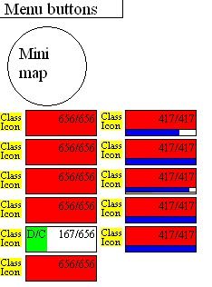
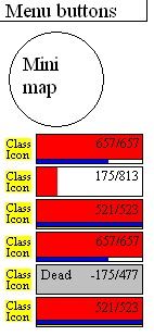
These are based on the best MMO UI I've ever used, the (player-created) Healbot addon to World of Warcraft.
Raid UI. Note the changed colour for a disconnect. Note HP numbers are right-aligned - the most important part of the HP bars, the lower end is unobscured. It's more important to be able to tell at a glance the difference between 20%hp and 40%, than it is to be able to distinguish 80% and 100%.

6-person group UI, note the wider HP bars (100 pixels not 80) and the colour of the dead player's HP bar.

Other things I'd like to see:
Class icons
We really should be able to have some control over how we appear here. A 'Tukaw' build (either the classic Sor16/Pal2/Mnk2 or the newer Sor12/Pal6/Mnk2) should be able to appear as a Paladin icon. Any character with Improved Precise Shot (Artificer, Ranger or Fighter) should be able to select a bow or crossbow icon. My unarmed Kensai 2 should be able to display a Monk icon. Anyone with Combat Expertise should be able to choose a shield icon. And so on.
Other uses of the UI
Left-clicking a player HP bar should target that player. Right clicking the bar brings up the present menu (boot from party, convert to raid etc). Add in functionality so that shift-left-clicking a player can have a spell or class ability assigned to it (e.g. a Favored Soul might assign Quickened, Empowered Heal to this mouseover ability). Likewise to Control+Leftclick, Shift+Control+Leftclick, all permutations with Alt.
- Shift-rightclicking a player's HP bar targets that player's target. Control-rightclicking, and perhaps other permutations, can have spells or class abilities bound to them, and will be used on the player's target. (Example: If Rishnarck the Monk has the Lord of Blades targetted, and I've bound 'Bestow Curse' to Control-Rightclick, then Control-Rightclicking Rishnarck's HP bar attempts to cast Bestow Curse on the LoB. If Rishnarck had a barrel targetted instead, Control-Rightclicking his HP bar would just bring up an error.)
Translucent UI
We should have some control over how translucent the UI is. Opaque as the default, with settings letting us see through it if we desire. (Healbot actually works the other way - something like 50% opacity is its default).Last edited by sirgog; 09-22-2011 at 09:16 PM.
I don't have a zerging problem.
I'm zerging. That's YOUR problem.


 Reply With Quote


